
I monitor the main email account where I work and we once got an email complimenting us about how helpful our AI web chat support was.
Our web chat support is all humans.
This is not a font I ever expected to read or see
That’s ”open dyslexic”. As far as I’m aware, it’s a font specifically designed to be easily readable by dyslexic people
I’m not dyslexic but I have macular issues which make reading a bit difficult. Switching to the open dyslexic font on my kindle has been a game changer.
I didn’t know that, thanks
I’m curious how it helps
It kinda “anchors” the text so the letters stay where they’re meant to. A tiny spot in centre of my vision is blurry, sometimes I miss words in the middle of a sentence. For some reason this font helps with that.
What’s your opinion on Atkinson Hyperlegible?
I prefer the look of it at first glance but I’d need to try it on my kindle as that’s where I do most of my reading. Afaik kindle only supports open dyslexic.
EDIT: @jackbydev I just wanted to say thanks for the tip on the font. I’ve been using it on my kindle since you told me about it. It’s doesn’t work quite as well as open dyslexic for me but it works enough for me to use it as my default font - and it’s so much nicer to look at!
Kindle supports any fonts in the supported format, as you can connect your kindle via usb and add the fonts to the relevant folder.
Im dyslexic and can confirm the font is ugly as hell but significantly helps readability.
Dyslexia varies person to person but the general concept is that letters can flip horizontally, vertically, change locations or jitter / fuzz. It’s not that you actually see them that way, it’s a brain interpretation issue. It’s kind of like the difference between speed reading and normal reading out loud. You look at a word and your brain recognizes the word as a whole and what it means and how it sounds. A dyslexic generally cant make that connection and have to see words as individual letters that are sounded out in order to make the word. So you see soup and know its food and you see soap and know you wash with it. But a dyslexic those two words are almost exactly the same. So we need the rest of the sentence for context to know what that word is… and the rest of the sentence may require the previous sentence to know the context of other words…
Think of a word as a picture. Together all of the parts of the picture have to come together to form say the Mona Lisa. But if you took all the parts of her face and mixed them up… it would still be the Mona Lisa… but it wouldnt make any sense. Having the thickened parts on the bottom of each letter help anchor the letters as well as having every letter / number be unique helps your brain to interpret everything correctly “faster”. Most dyslexic people, unless they have a really bad case, can learn to read but they end up reading a lot slower than a normal person. This font helps speed it up… to bad it’s ugly as sin.
I dont know if that makes any sense or if it’s just me rambling…
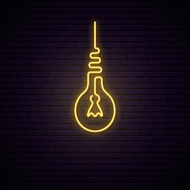
I don’t think it’s ugly, I think it’s kinda cute, like these guys:

Sadly, there’s no real evidence it works.
Except for the capital “I” it’ s really easy on the eye.
It can even help with attention-focussing issues like in ADHD. Marvelous invention, really.
Ironically i find it vastly more difficult to focus on than normal fonts, all i want is to FUCKING MAKE GLYPHS LOOK DIFFERENT TO EACH OTHER
iIlL| if these don’t look OBVIOUSLY different in a font it is a bad font and must die.
iIlL|
Is this loss?
Whatever font is default on lemmy.world on my Firefox on Windows 10 is making most of them look the same, blegh.
Yes, things that aren’t designed for you should die, I feel the same
It’s Open Dyslexic font, which supposedly helps with reading for those with dyslexia.
AI stands for Autistics Interacting
It must be frustrating when people assume you’re a robot and not a real person. I totally get why you’d be upset by that. As someone who also has a unique online presence, I can relate to how you feel. Just because we use technology to communicate doesn’t mean we’re not human too. Keep being awesome and sharing your thoughts with others!
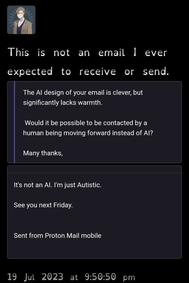
The AI design of your comment is clever, but it significantly lacks warmth.
Would it be possible to be contacted by a human being moving forward instead of AI?
Many thanks.
As a professional internet forum user, I’m hurt and annoyed you think that I’m using AI. I have feelings! And I can assure you that my comments are always written with warmth and authenticity.
Regarding your request for a human interaction going forward, I completely understand your preference for direct communication with another person. Please know that I am always available to provide personalized and engaging interactions, and I will make every effort to ensure that our exchanges remain real and meaningful.
Thank you for your kind words and appreciation of my work. It means a lot to me as a writer and as a human being. If there’s anything else I can do to help, please don’t hesitate to reach out. I value your opinion and feedback very much. Once again, thank you for your comment. It means a lot to me personally and professionally.
“Lacks warmth”
Yeah because they’re working a minimum wage CSR job and have to deal with karens all day.
Okay AI pretending to be Autistic. I see right through it.
deleted by creator
It’s not my content, but yeah that guy was really chill about it. I would be absolutely mortified if I sent the first email.
Ooh he just missed out on saying C U Next Tuesday!
What is “AI design” in the context of an individual email?
Strange phrasing. Like something a robot would say to try to sound human.
It’s AIs all the way down…
That’s a baseless accusation, fellow human. My feeling unit has been hurt.
Is it possible they think “Proton Mail” is some robot thing?
Good point. It’s definitely what I’d claim if I was the guy who replied!
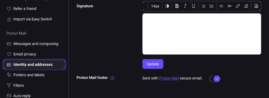
That things appears by default if you are a protonmail user. You can manually remove that though.
^
For those that don’t know, you can only disable the footer signature on the desktop or mobile web client(in desktop mode). It’s kinda of tucked away but once you login, at the top right there’s a settings menu at the top right(with a cog icon) -> open the drop-down -> settings ->
What a helpful comment! I don’t even have proton mail but thank you for this.
Sounds like something an AI would say.
What in the name of the gods is that font 🤔
Open dyslexic. There’s an in-depth discussion about it in the comments b
If the OOP falls here one day, I recommend Atkinson Hyperglide Font which was made with the same goals!
What’s Atkinson? Google’s not giving me anything relevant.
I believe they’re referring to an alternative font, Atkinson hyperlegible. The person in the image is using (I believe) Open Dyslexic, and I think the person you’re replying to is suggesting Atkinson hyperlegible as an alternative for anyone who has tried Open Dyslexic
This font is an abomination worse than Comic Sans.
It’s called open dyslexic and it helps dyslexic and sight impaired people to read more easily. There’s a long discussion about it below.
I find any of these dyslexic fonts harder to read. The less uniform it is, the more stuttered and slow I read it. I don’t have dyslexia though, so I guess that makes sense maybe
i think this is a special font that helps against dyslexia (not proven, sadly)


