- cross-posted to:
- android@lemmy.world
android-developers.googleblog.com
- cross-posted to:
- android@lemmy.world

To fit more ads!
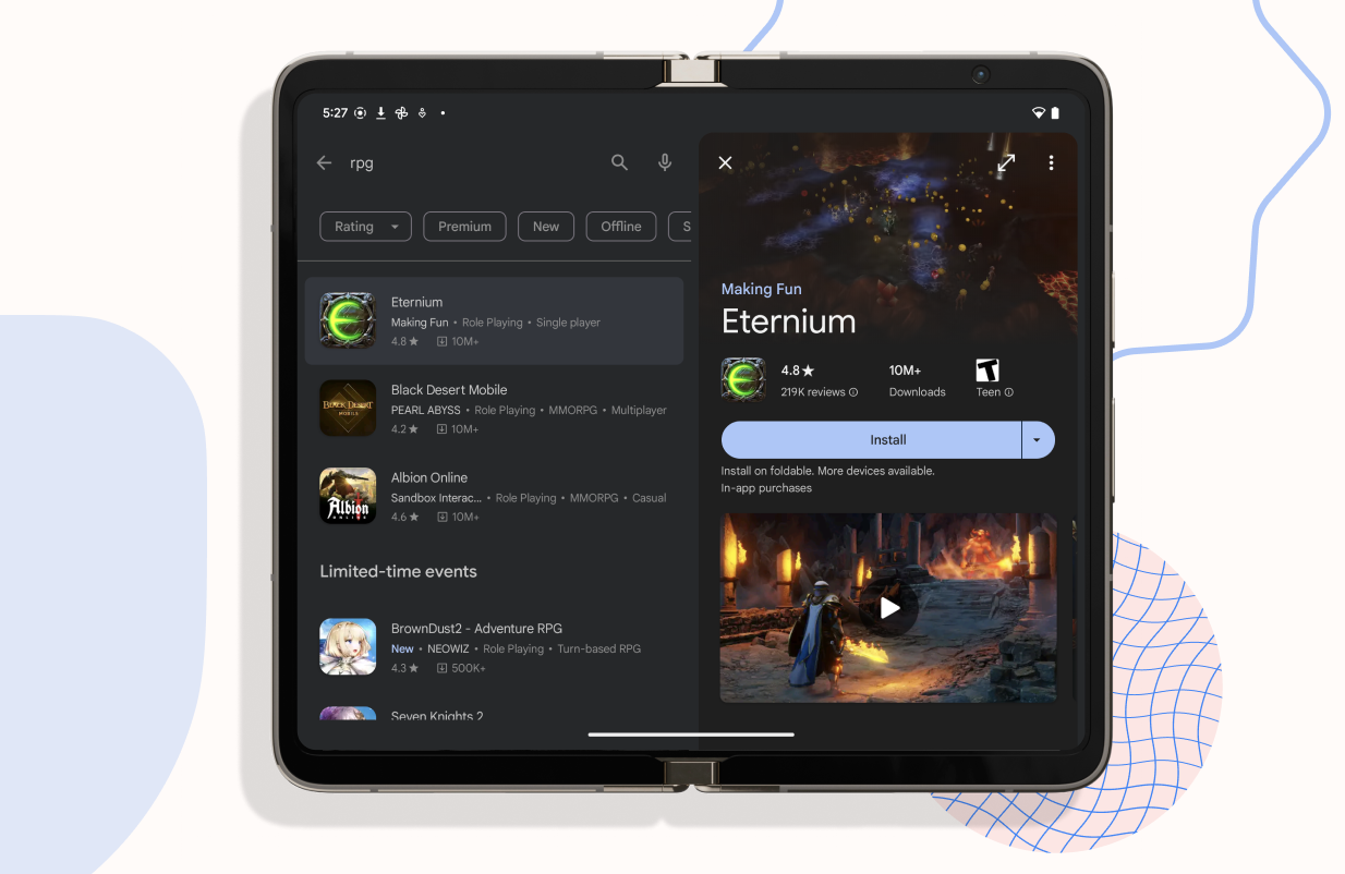
Even the splash screenshot is, what the fuck? Two giant “blogspot” blocks and two and a half “event” blocks are visible in the Apps view. Is that supposed to be the tablet UI?
This should have happened like 12 years ago.
I got a little excited for Android TV when I saw “big screens.”
Deranking apps that don’t scale well with tablets should hopefully push more companies to get that sorted
huh, the first play store update I’ve seen in a while that’s actually good? What times we live in
Hopefully this also makes it to ChromeOS given they leaned towards the “large screen devices” wording. Would make browsing easier.
I think “large screen” is used to encompass tablets and foldables, but ChromeOS has had it’s own unique interface for a while now


