Basically the title. If it feels like the new method in iOS 17 of hitting the plus symbol, then scrolling up and then selecting photos in iMessage takes too long you can just long hold the plus symbol and it’ll short cut to pics.
Edit: Also you can drag and rearrange apps in the + menu as well.


Oh this is gold ! Long hold the spacebar on the keyboard allows you to move the cursor is another one few people know but changed my life.
Coming from Android and Google keyboard this is an amazing feature. I hated trying to move the cursor with the apple keyboard.
If they only would have kept 3D Touch. This feature was twice as powerful back then.
Right now you can only move the cursor and select (by tapping with another finger). But you can’t de-select. You could do all that with just your thumb with 3D Touch.
Too bad apple refises to provide a manual with these kinds of features in it. That’d be useful. No, it’s not intuitive, clearly.
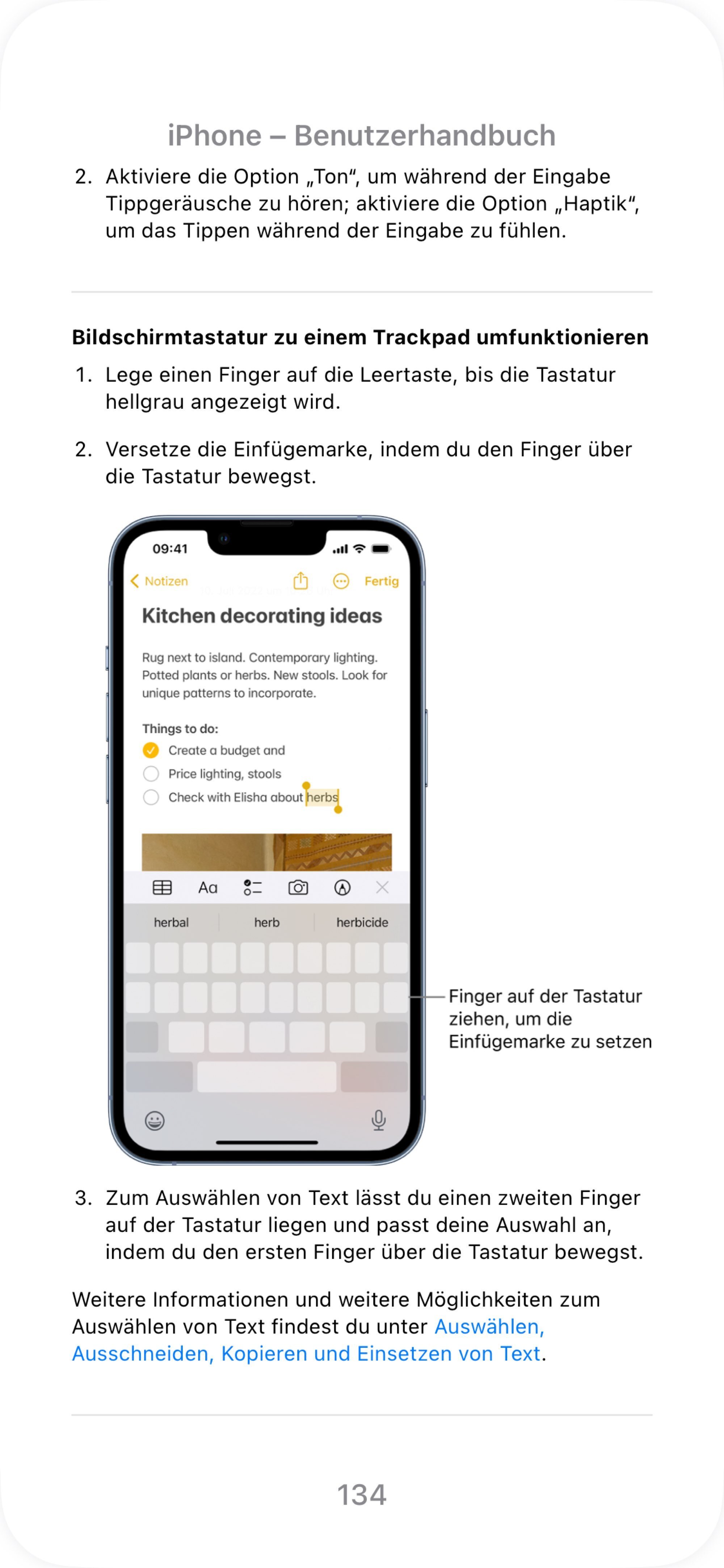
There is a very detailed manual with each version of iOS actually. The keyboard is explained too, including this :)
You can find them in Apple Books (Picture in German)
This is amazing, however not being able to search by release number is not great, not being able to sort by newest release is not fantastic either. 30 minutes of searching and still unable to find iPad or iPhone for iOS 17.
Yeah, I’m not sure they’ve been released yet, which is strange.
You’re right, looking for them in Books works really bad. As another commenter said, it looks like for iOS 17 is still not available.
On a side note: I just saw that you can look up an interactive version of the manuals through the “Tips” app. Much more user friendly and it contains everything that is in the eBook - albeit still iOS 16 even though my iPhone is up to date.
I had seen some of the stuff in tip (did not realize that was an actual app that I could look at again, thank you) but see nothing in it about the long press stuff sadly.
Yeah I think it is a new feature of iOS 17, the manual of which seems to be still missing
I figured out the stickers on my own.
The lack of discoverability is the biggest problem with long press interactions. If something looks like a button a user knows they can press it, but there’s no visual indication something can be long pressed.