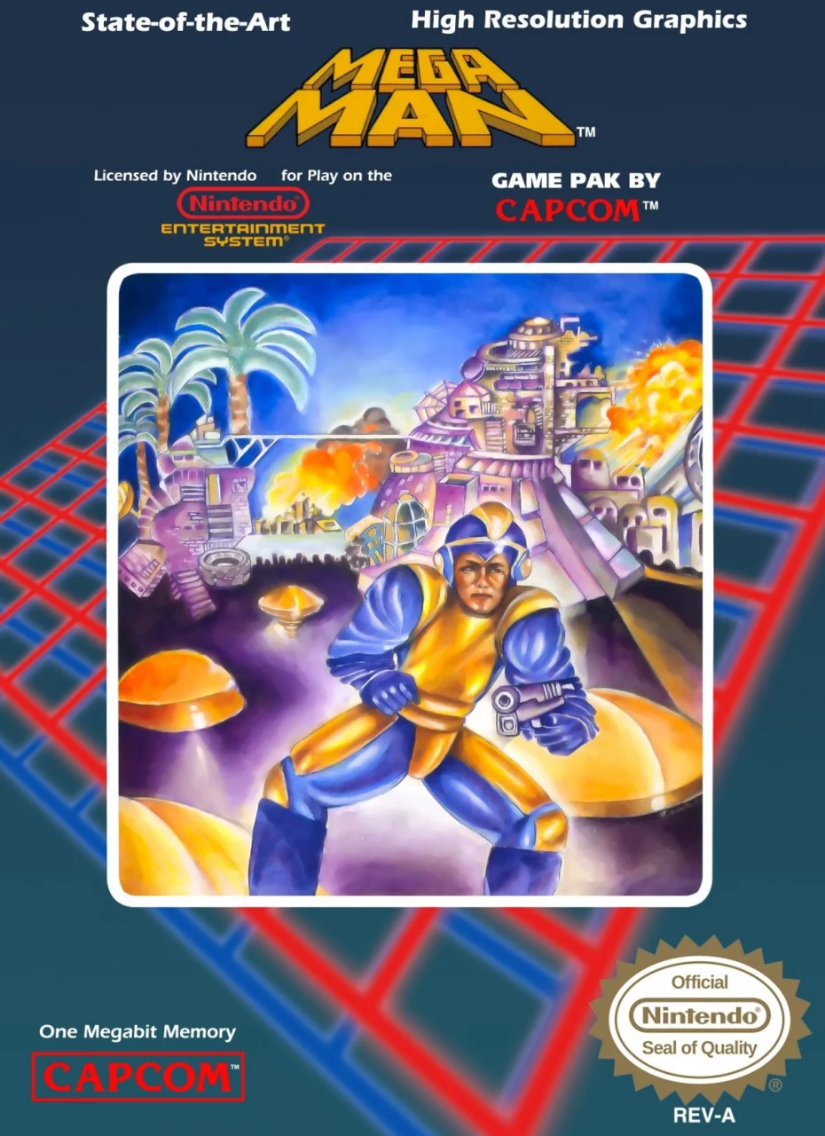
Believe it or not, that artwork was an improvement

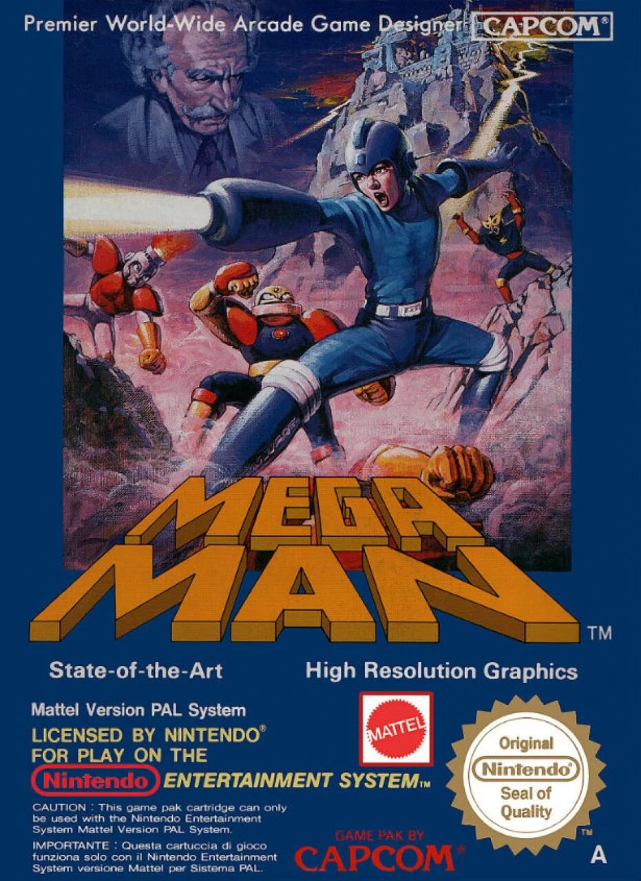
That was the American cover for Mega Man 1. This is the European cover.
The European cover for Mega Man 1 was epic:

deleted by creator
I still remember my older brother renting mega man back when I was 9 or 10 years old and I looked at the box art and said “this looks like a terrible game”. And then the game itself was epic for its time.
So, the Dragon is from one of the Wily stages. The fish is from Bubble Man’s stage. The castle on top of the hill is Wily’s base.
But what the hell is that face to the right of Mega Man’s shoulder?
I’m guessing the big heads from Air Man’s level.
deleted by creator
Bowling pin arm man
They paid Soriyama $100,000,000 to paint this.
So were the artists of those first 2 games just not aware of the game? Were they just given a vague direction of what to draw?
It’s not exclusive to megaman. Box art in the US (maybe Europe) went through a weird phase in the NES era.


